
Most people won't read your blog post. They'll skim it. They'll scroll for a few seconds, glance at the headings, and decide whether it's worth their time.
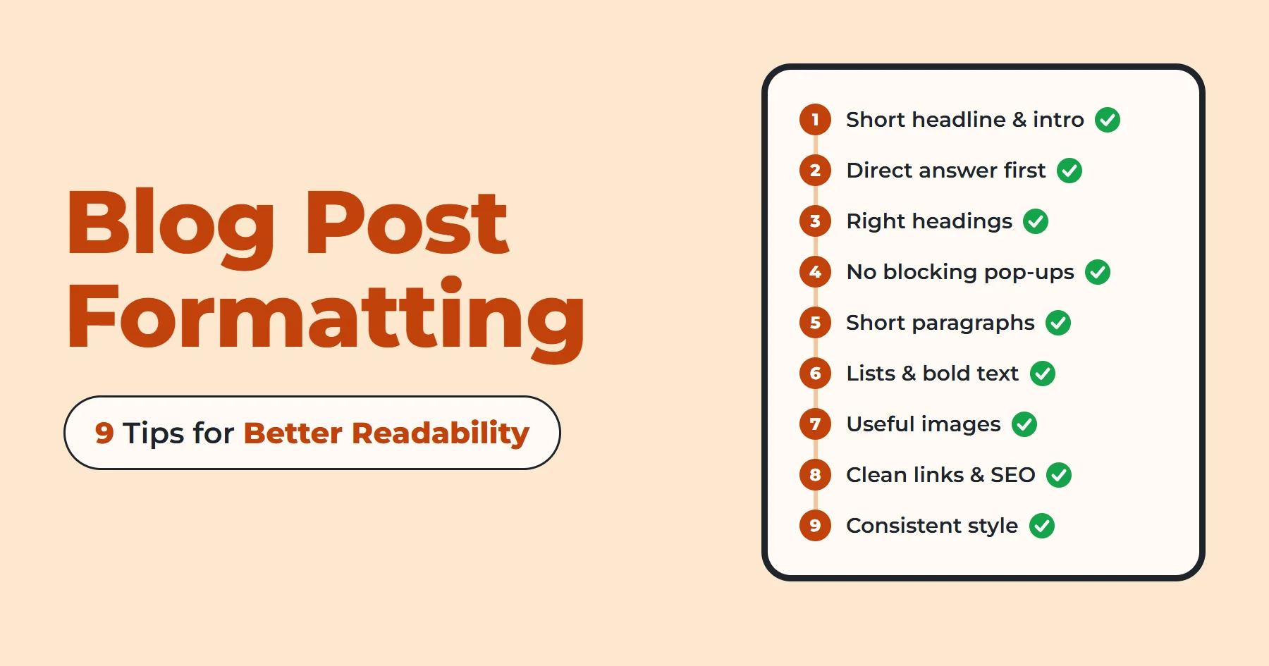
Even great writing can be hard to read if it looks like one big block of text. Good blog post formatting makes it easier for readers to follow your content. Here are nine simple ways to make your blog posts easier to read.
1. Keep Your Headline and Intro Short
Your headline has to earn the click. Keep it brief, and put your main keyword close to the start. I've shared 30 headline examples and practical ways to write better headlines in my guide to blog title examples.
Your introduction should be just as easy to scan. Two or three short paragraphs are enough. For ideas on what to write, check out my Blog Introduction Examples post.
2. Give Readers a Direct Answer Right After the Introduction
Once you've introduced the problem, don't make readers search through the post for the answer. Give the main answer near the top of the post in a short paragraph or an easy-to-find list.
When readers find the answer quickly, they're more likely to keep reading. If they can't find it, they may return to the search results.
Background, definitions, and "nice to know" details can wait until later in the post.
I made a small change to my first post, Blog Writing Examples. I had placed "What Makes a Good Blog Post?" right after the introduction, but readers were there to see blog writing examples. So I moved that section further down to get to the examples sooner.
3. Use Headings and Subheadings (H1, H2, H3) the Right Way
Headings help readers quickly find the information they're looking for.
Here's how the hierarchy works:
- H1: the title of the post. Use only one per page.
- H2: your main sections.
- H3: smaller points under an H2.
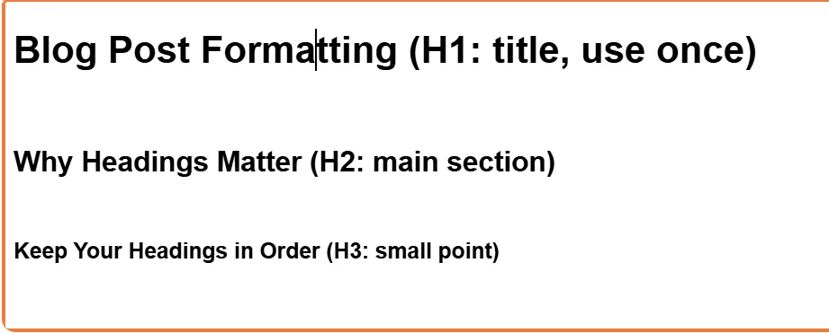
Keep your headings in order. For example, use an H2 under an H1 instead of jumping straight to an H3. A proper heading order helps screen reader users navigate your post more easily.
Make your headings specific. "Tips" tells the reader nothing, while "Three Ways to Shorten Your Paragraphs" tells them exactly what's coming.
Even if readers only scan your headings, they should be able to tell what your post covers. Break up long sections with headings wherever a new topic or idea begins.
If a heading sounds awkward when you read it aloud, rewrite it.
4. Avoid Pop-Ups and Banners That Block the Content
You open a blog post, and before you can read anything, a pop-up takes over the screen. That's enough to make many readers leave, especially on a phone.
- Keep the first screen clear. Let readers see your title and the start of your post before anything else appears.
- Avoid full-screen pop-ups. If you want to promote something, like a newsletter, a small box at the end of the post or in the sidebar is less annoying.
- Make sure banners are easy to close. A tiny close button or one that's hard to tap can frustrate readers.
5. Use Short Paragraphs and White Space
Long paragraphs can feel tiring to read. Short paragraphs make your content easier to follow.
Keep paragraphs short and focus on one main idea at a time. When you start a new thought, start a new paragraph. Short, clear sentences are also easier to follow, especially for readers who are distracted or reading in a second language.
White space is important too. Good blog post formatting gives your text enough space to breathe and makes the page easier to read.
- Choose a font size that's comfortable to read on both desktop and mobile.
- Use enough line spacing to keep the text comfortable to read. Around 1.5 times the font size is a good starting point.
- Keep text lines from stretching too far across the screen.
A paragraph that looks short on a laptop may take up much more space on a phone.
Here's a quick example of how much this matters.
Before: "Formatting is important because readers who visit a blog usually want to find information quickly, and if the text is presented in a large block without any breaks, they will likely feel overwhelmed and leave the page before they have had a chance to read the useful things you wrote."
After: "Readers want answers fast. A giant block of text can push readers away. Break it up, and it's easier for them to keep reading."
6. Use Lists, Bold Text, and Callouts
Lists make it easier for readers to scan your post and find key information. Use a numbered list when order matters, like steps in a process. Use bullets when the items are tips, features, or examples. Keep list items short and use a similar structure for each one.
When comparing information side by side, a simple table can be easier to follow than a list. Use clear column headings and include only the information readers need.
Bold text draws attention to important words and phrases, so use it only when needed. If half your paragraph is bold, nothing stands out.
Here's a simple test: if readers looked only at the bold text, would they still understand the main points?
Italics are better for light emphasis, like a book title or a single stressed word.
Pull quotes and callout boxes can highlight important points and break up long sections of text. Just don't use too many. One or two per article is plenty. Too many callout boxes can make the page look cluttered.
7. Use Images and Visuals Effectively
A good image can help explain your point and give readers a break from long sections of text. Add images, screenshots, or other visuals when they support your content.
Keep these tips in mind when adding images and other visuals:
- Make them relevant. Skip stock photos that don't relate to your topic. Use screenshots or diagrams when they help explain something. For text-focused topics, I usually add one or two screenshots of my own.
- Write descriptive alt text. Add a short description to the image's alt attribute so screen readers can describe the image. It also helps search engines understand what the image shows.
- Compress your images before uploading them. Large image files can slow down your page and make readers wait longer. Also, make sure your images fit the screen on smaller devices. I use Squoosh to reduce image file sizes without noticeably affecting their quality.
Keep accessibility in mind, too. Make sure the text is easy to read against its background, and don't use color as the only way to show meaning.
8. Format Your Links and SEO Basics Properly
Links are part of formatting too. They help readers find related information and move between pages.
Link to your own related posts so readers can keep exploring. Link to reliable sources when you include statistics or information from other websites. This lets readers check the original information for themselves.
Make sure links look like links, with a different color or an underline, so readers know what's clickable.
Pay attention to anchor text, the clickable words in a link. "Click here" doesn't explain where a link leads. Text like "our guide to writing strong headlines" gives readers a better idea of what they'll find.
Keep these basic SEO details in mind when publishing your post:
- Meta description: Keep it concise and relevant. Around 150 to 160 characters is a useful target, but Google may show a shorter or longer version.
- URL slug: Keep it short and clean, like /blog-post-formatting.
- Keywords: Add your main keyword where it fits naturally, including in relevant headings. Stuffing the same phrase into every paragraph hurts readability and can hurt your rankings. If a sentence reads like it was written for a search engine instead of a person, rewrite it.
9. Keep Your Formatting Consistent
When headings, fonts, or spacing change from one section to another, a post can look inconsistent.
- Headings: Choose either Title Case or Sentence Case and use it everywhere. I wrote about the difference in Sentence Case vs Title Case.
- Fonts, spacing, and list style: Keep them the same from one post to the next. I use the Montserrat font for my text and headings. It's clean and easy to read on any screen.
- Proofreading: Read the whole post once from top to bottom before publishing. I use Grammarly to check my writing before formatting the post.
My Personal Checks Before Publishing
Before I publish a post, I run through a few quick checks.
I preview my post on both my phone and desktop. A post that looks good on a computer may not look as good on a phone. I found a formatting issue in my last post, Sentence Case vs Title Case. One list in that post had a display issue: the number 10 didn't display correctly in the list on either desktop or mobile. I spotted it in the preview and fixed it.
Before:

After:

I click every link. A link that goes to the wrong page, or nowhere at all, makes a post look unfinished.
I open the live page after publishing. Sometimes it looks different from the preview, so I check it once more before sharing the link.
I search the post for square brackets and empty paragraphs. Leftover notes to myself are easy to miss when I'm editing.
I check tables on my phone. I make sure all the content is visible and easy to read.
I look at the first screen on my phone. I make sure the title and opening are easy to find.
I check the page in dark mode. Some text or images can look odd against a dark background.
I wait a few hours before reading the post one last time. Typos stand out much more with fresh eyes.
Common Blog Formatting Mistakes to Avoid
Even experienced bloggers make these formatting mistakes:
- Too much styling. Five colors, three fonts, and bold everywhere make a post look messy.
- ALL CAPS. Using all caps for long sections can make your post harder to read.
- Centered paragraphs. Left-aligned text is easier to follow, so save centering for short things like captions.
- Headings used as styling. Don't turn a line into a heading just to make it bigger or bolder. Headings are for structure.
Your Blog Post Formatting Checklist
Check these points before publishing to catch common formatting problems.
- Is the title clear, concise, and relevant to the post?
- Does the introduction clearly address what the reader is looking for?
- Do you give readers a direct answer to their question right after the introduction?
- Is the heading hierarchy correct (one H1, then H2s, then H3s)?
- Is the first screen free of pop-ups and banners that block the content?
- Are paragraphs short and easy to read?
- Are lists and bold text used sparingly and on purpose?
- Does each informative image have useful alt text and a reasonable file size?
- Are links descriptive, with no "click here"?
- Are the meta description and URL slug ready?
- Is the style consistent throughout the post?
FAQs
Should I format my post while I write or after?
Write first, then format. If you keep adjusting headings and bold text while writing, you'll interrupt your flow and take longer to finish. Treat formatting as a separate pass once the draft is done.
Do I need to go back and fix my old posts?
It's worth reviewing your old posts, but you don't need to update them all at once. Start with your most visited posts so more readers can benefit from the improvements.
Is it okay to use emojis in a blog post?
Yes, in moderation. A few can add a little personality to your post, but too many can make it harder to read. Screen readers may also announce emojis by name, so using too many in a row can make the content harder to follow.
Can I write in Google Docs or Word and paste into my blog?
You can, but copying text from Word or Google Docs may also bring unwanted fonts, spacing, or other formatting. Paste as plain text and then add your headings and lists again in your blog editor.
Conclusion
Good formatting doesn't change your message. It makes it easier for readers to stay focused and understand what you're saying. Before publishing your next blog post, use the checklist above to spot and fix any formatting issues.
You don't need to apply all nine tips perfectly right away. Start with two or three tips and see how they improve your posts. If you'd like help with the last part of a post, check out my post on how to write a good conclusion.