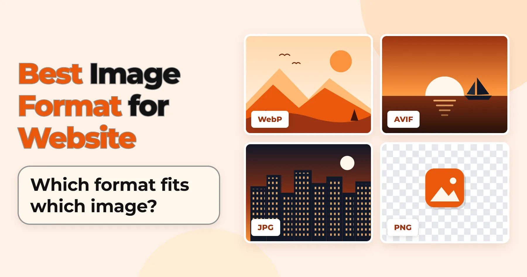

Which is the best image format for website use: WebP, AVIF, JPEG, PNG, or SVG?
The answer depends on the image and where you plan to use it. A format that works well for a blog photo may not suit a logo or screenshot.
Below is a pick for each image type, plus the code to serve it properly.
Table of Contents
- Quick Answer: Which Image Format Should You Use?
- WebP Image Format
- AVIF Image Format
- SVG Image Format
- PNG Image Format
- JPG Image Format
- HEIC Image Format
- GIF Image Format
- Does Image Format Affect SEO?
- Best Image Format by Platform
- How to Add the Right Format to Your Website
- Conclusion
Quick Answer: Which Image Format Should You Use?
For most website photos, WebP is the best place to start. AVIF can shrink files further, but test it first. The list below covers every other case.
Hero and blog photos: WebP or AVIF
Start with WebP. Try AVIF when you need smaller files.
Product images: WebP or JPEG
Keep enough detail for shoppers to zoom in.
Logos and icons: SVG
Use PNG if your platform rejects SVG.
Screenshots: PNG or lossless WebP
JPEG compression can blur small text and introduce artifacts around sharp edges.
Transparent graphics: SVG, PNG, WebP, or AVIF
SVG suits vector art. PNG, WebP, or AVIF suits raster graphics.
Social share images: JPEG or PNG
Newer formats may not work on every platform.
Animations: MP4, WebM, or animated WebP
GIF works for short, simple loops.
Image Formats Explained
WebP Image Format
Google developed WebP to reduce image file sizes while maintaining good visual quality.
It compresses in two ways: lossy, which drops some detail, and lossless, which keeps every pixel. It also supports transparency and animation.
Compared with JPEG, WebP often gives a smaller file for a photo that looks the same. All major modern browsers support it, so it works for most websites.
Keep your original JPEG or PNG files as master copies, and publish WebP versions. If a WebP comes out bigger, use the original.
AVIF Image Format
AVIF is built on the AV1 video codec. It also handles transparency, animation, and HDR images.
For photos, AVIF can often produce smaller files than WebP at comparable visual quality. However, the results depend on the image and encoding settings. Encoding takes longer, though, and some editing tools handle AVIF poorly.
Current versions of all major browsers support it, but older ones may not. Serve it with a WebP or JPEG fallback, using the code below.
SVG Image Format
SVG stores graphics as shapes and paths instead of a fixed grid of pixels. That makes it ideal for logos, icons, and simple illustrations. These graphics stay sharp at any screen size.
SVG is not suitable for photographs. It can also contain code, so only upload files from trusted sources. Some platforms block or sanitize SVG uploads.
You can reduce SVG file size with a free online tool such as SVGOMG before uploading. Check the optimized file to make sure it still looks correct. Optimizing does not make an unsafe file safe.
PNG Image Format
PNG is lossless, so it keeps the original detail when you save. It also supports transparency. Text and sharp edges stay clean, which suits screenshots.
Photos saved as PNG are usually much larger than the same photos in JPG or WebP. For a full breakdown, read Difference Between PNG vs JPG.
On my own site, I keep the logo and favicon as original PNG files. If you are starting fresh, SVG is the better logo format. My feature images and post images are all WebP.
JPG Image Format
Photographs are where JPG works best, thanks to its lossy compression. Almost all browsers and image-editing tools support it. It does not support transparency.
Use it as your fallback when your platform cannot serve WebP or AVIF.
HEIC Image Format
iPhones can save photos as HEIC to reduce file sizes while maintaining image quality.
Browsers do not support it reliably, so avoid uploading it directly. Convert it to JPG or WebP first.
To learn more about opening and converting it, read What Is an HEIC File?
GIF Image Format
GIF is an older format for simple animations. It supports only 256 colors, so it is unsuitable for photographs. Animated GIFs can also be much larger than equivalent videos.
Does Image Format Affect SEO?
Not directly. Google's image guidelines list BMP, GIF, JPEG, PNG, WebP, SVG, and AVIF as supported formats.
Google recommends optimizing images for quality and loading performance, rather than choosing a format for SEO alone.
Speed is where format matters. A smaller hero image can reduce download time and help improve Largest Contentful Paint (LCP). LCP measures how long it takes for the largest content element in the visible area to appear.
Best Image Format by Platform
Website platforms handle uploads differently. Some convert images for you, while others serve your files as they are. That decides what you should upload.
Platform features change, so check the current documentation before relying on any detail.
WordPress
WordPress supports WebP uploads from version 5.8 and AVIF uploads from version 6.5, provided your server supports the format. By default, WordPress does not automatically convert JPEG or PNG uploads to WebP or AVIF.
The Modern Image Formats plugin, from the WordPress Performance Team, can do this. By default, it generates modern image versions for new uploads. To convert existing images, regenerate their image sizes using a plugin or WP-CLI.
AVIF support also depends on your hosting. Your server's image library must support it. Check Tools → Site Health → Info → Media Handling to see whether AVIF is listed.
WordPress does not allow SVG uploads by default. Use a trusted plugin that sanitizes SVG files before uploading logos or icons.
Shopify
Shopify checks the visitor's browser. When a visitor's browser supports WebP or AVIF, Shopify may deliver images in those formats.
It picks the best format for each image, so AVIF is not guaranteed every time. It also converts GIFs to animated WebP.
Upload JPG or PNG files and let Shopify handle delivery. It accepts SVG files, but cannot resize or crop them unless it first rasterizes them.
Wix
Wix converts uploaded images to AVIF on your live site. You do not need to make AVIF files yourself.
Wix does not support animated WebP. It turns animated WebP uploads into static images, so test animations after uploading.
Squarespace
Squarespace accepts JPG, GIF, PNG, and WebP image uploads. It does not support animated WebP files.
Squarespace automatically creates up to seven image sizes for different screens. For faster loading, it recommends keeping uploaded images under 500 KB.
How to Add the Right Format to Your Website
Picking a format is only half the job. The page also has to deliver the right file.
Shopify and Wix manage much of the image delivery process automatically. The following code is more useful if you run a WordPress or custom-built website.
Fallback Code (<picture> Tag)
The <picture> element lets you offer one image in several formats. The browser checks the available sources in order and selects the first compatible format.
<picture>
  <source srcset="photo.avif" type="image/avif">
  <source srcset="photo.webp" type="image/webp">
  <img src="photo.jpg" alt="Describe the image here" width="800" height="533">
</picture>
Keep these points in mind:
- Order matters. Put your preferred format first. Here, the browser tries AVIF, then WebP, then JPG.
- The
<img>element is essential. It holds the fallback file, the alt text, and the dimensions. - You need the actual files. The code only points to them. Create
photo.avif,photo.webp, andphoto.jpgyourself, or use a plugin or CDN that does it.
Image Sizing
A WebP file is still heavy when the image is far larger than its space. Format and size both matter.
Resize images to fit their display area. If your content column is 800 pixels wide, a 4000-pixel image is unnecessary. A common starting point is twice the display width, such as 1600 pixels for 800. Adjust this to your layout.
Add width and height attributes. These values give the browser the image size ahead of the download. The browser then reserves room for it, which reduces layout shifts.
Use srcset to offer different sizes. A phone often does not need the largest image file intended for desktop screens. Provide several versions and let the browser choose:
<img
  src="photo-800.jpg"
  srcset="photo-400.jpg 400w, photo-800.jpg 800w, photo-1600.jpg 1600w"
  sizes="(max-width: 800px) 100vw, 800px"
  width="800"
  height="533"
  alt="Describe the image here">
srcset lists the available files and their actual widths. The sizes attribute tells the browser how much screen space the image will use. The browser then picks a suitable file.
Lazy Loading
Lazy loading delays image downloads until visitors scroll near them. This cuts the work at page load, especially on long pages.
For an image lower on the page, use:
<img src="photo.jpg" loading="lazy" width="800" height="533" alt="Describe the image here">WordPress commonly adds lazy loading automatically, so your site may already use it.
Do not lazy-load your LCP image. If your main hero image is the LCP element, delaying its download can slow down page loading. You can give it higher loading priority with fetchpriority="high":
<img src="hero.jpg" fetchpriority="high" width="1200" height="600" alt="Describe the image here">Use high priority only for images that really matter.
Conclusion
The best image format for website use is the one that fits each image. Start small: convert a few representative photos to WebP and compare their file sizes at similar visual quality.
If WebP produces smaller files without a noticeable loss in quality, use it for similar photos on your website. Test other image types separately before choosing their formats.